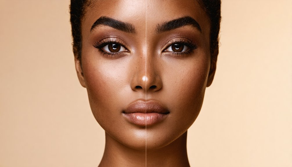

For deep skin tones, undertone — not depth — determines whether a foundation disappears or turns ashy, muddy, or mask-like. Your undertone stays fixed even as your surface tone shifts seasonally. Check your inner wrist veins in indirect daylight, then confirm with gold versus silver jewelry and white versus cream fabric near your face. Once you’ve identified whether you’re cool, warm, neutral, or olive, shade-matching becomes far more precise — and everything covered ahead will sharpen that process notably.
Key Takeaways
- Undertone—cool, warm, neutral, or olive—determines whether foundation looks ashy or natural, and stays fixed regardless of seasonal skin tone changes.
- Test undertone by checking wrist veins in daylight: blue-purple indicates cool, green indicates warm, mixed indicates neutral, and teal indicates olive.
- Confirm undertone by holding gold versus silver jewelry near your face; gold warming skin signals warm undertone, silver brightening signals cool.
- Swatch 2–3 foundation strokes on the jawline in natural daylight; the correct shade disappears without gray cast, orange pull, or visible lines.
- When no shade is dark enough, mix two adjacent deep shades or layer a yellow or golden-toned setting powder over a lighter base.
How Undertone Affects Foundation Matching on Deep Skin
When shopping for foundation with a deep complexion, getting the depth right is only half the equation — undertone does the real deciding work. Even if a shade matches your depth perfectly, the wrong undertone makes your skin appear ashy, muddy, or mask-like.
Cool deep undertones lean purple or red beneath the surface, so foundations with red or berry bases harmonize best. Warm deep undertones read golden or peachy, meaning bronze or caramel-based formulas are your allies. Neutral and olive undertones need balance — too warm reads orange, too cool reads bruised.
When multiple shades match your depth but none look right, shift the undertone family, not the depth. That single correction changes everything. Your undertone stays constant even as your surface tone shifts with tanning or seasonal changes.
What Your Vein Color Reveals About Your Undertone
One of the quickest undertone tests requires nothing more than your inner wrist and natural daylight. Check your veins in indirect sunlight, never under warm indoor lighting, which shifts green and skews your read toward warm undertones.
Blue or blue-purple veins suggest cool undertones. Green veins point to warm. A mix of both indicates neutral, while teal leans olive.
On deeper skin, elevated melanin absorbs light and mutes vein visibility, so don’t rely on one spot. Check your inner wrist and inner upper arm, then assess the overall impression rather than isolating a single vein.
The vein test is a useful starting point, not a definitive answer. Treat it as one clue among several, especially when visibility makes confident interpretation difficult. If veins remain hard to read, warm versus cool clothing against your face can surface undertone signals without requiring vein visibility at all.
Fabric and Jewelry Tests That Confirm Your Undertone
The vein check on the underside of your wrist narrows your undertone range, but fabric and jewelry tests sharpen that reading with visible, side-by-side contrast.
Hold plain gold and silver jewelry near your face in daylight. Gold that warms and softens your complexion signals warm undertone; silver that brightens and adds crisp contrast signals cool. Ashiness or muddiness means mismatch.
Next, drape pure white against cream fabric under your chin. White that clarifies your features points cool; cream that adds a golden glow points warm. Both flattering equally suggests neutral.
Cross-check both tests. Gold preference paired with cream fabric confirms warm undertone. Silver preference paired with pure white confirms cool. Discrepancies between the two tests mean you’ll need colored fabric drapes before assigning a final classification. These tests work because color theory principles explain how gold reflects warm light into a complexion while silver does the same for cool tones.
What Cool, Warm, Neutral, and Olive Undertones Look Like on Deep Skin
Once both tests agree on a classification, you can map that result onto the actual visual characteristics of your complexion.
Cool deep skin carries a blue-red or ashy cast — think red-cocoa or blue-brown rather than golden-brown — with berry and plum midtones.
Warm deep skin reads golden-bronze or honeyed, with caramel and amber midtones that intensify beautifully under warm light.
Neutral deep skin presents as balanced cocoa or espresso without a dominant color cast, responding well to both warm and cool palettes.
Olive deep skin layers a green-gray or golden-green cast beneath the surface tone, functioning as a hybrid undertone. Unlike your surface skin tone, which can shift with sun exposure or seasonal changes, this underlying cast remains fixed and should anchor your product selection year-round. Undertones remain constant regardless of how much time you spend outdoors.
Each category is visually distinct, and recognizing yours eliminates guesswork when selecting foundation, concealer, or any complexion product.
Foundation Labels That Help You Find Your Shade
Foundation labels can feel like a foreign language until you know how to decode them, but most brands rely on a consistent two-part system: a number for depth and a letter for undertone. Higher numbers signal deeper shades, so you’re scanning the upper end of any range. The letter tells you everything else — W means warm, C means cool, N means neutral, and some brands add O for olive.
A label like 5W means depth level five with warm pigment balance. MAC’s system runs slightly differently, where NC skews golden and NW counters cooler complexions. Once you understand the logic, you stop guessing and start selecting with precision — which is exactly the control you deserve over your own beauty choices.
For drugstore options, brands like L’Oréal True Match use the same letter coding system, so a shade like W4 indicates a warm light-medium golden tone.
How to Swatch Foundation Correctly on Deep Skin
Decoding a foundation label gets you to the right section of the shade range — but swatching correctly is what confirms the match. Start with clean, moisturized skin and blot any excess oil so surface shine doesn’t distort your read. Assess your jawline in natural daylight first — it’s your truest reference point for depth and undertone.
Apply 2–3 adjacent shades in short strokes along your jawline, leaving visible space between each. Use a realistic application amount, not a thick test stripe. Gently blend the edges, then step into daylight. The right shade disappears — no gray cast, no orange pull, no visible line.
Avoid swatching on your hand. That skin tells a different story than your face. When evaluating your final choice, check that it blends seamlessly with both your face and neck for continuity.
Why Some Foundations Turn Orange or Ashy on Deep Skin
A foundation can look perfect at application and turn orange or ashy within hours — and the reason isn’t random. Your skin’s oils react with iron oxide pigments, intensifying warmth and pushing neutral shades toward rust or orange during wear.
As water and silicones evaporate, pigments concentrate and clump, deepening color further. If your undertone runs cool or neutral, a warm-yellow formula reads balanced at first, then oxidizes into something unrecognizable.
Ashiness follows a different path. High levels of titanium dioxide and mineral SPF filters reflect light unevenly on deep skin, leaving a gray or pale cast.
Layering incompatible primers and SPF bases worsens this, separating the formula and disrupting pigment dispersion. Knowing these mechanics helps you filter out formulas designed to fail on your skin. This issue is not limited to budget options, as both drugstore and luxury foundations are equally prone to oxidation regardless of price point.
How Hyperpigmentation and Redness Skew Your Shade Match
Oxidation and formula chemistry are only part of why shade matching fails on deep skin — your complexion’s existing discoloration introduces a second layer of optical interference that’s just as disruptive. Hyperpigmentation around your mouth, chin, and temples often reads several shades deeper than your actual tone, pulling your shade selection darker than your neck and chest warrant.
Meanwhile, redness from acne or inflammation mimics warmth, tempting you toward golden or warm foundations that amplify the problem instead of solving it. Both conditions distort your perceived undertone before you’ve even opened a bottle. Unlike your undertone, which is a permanent sub-dermal pigment characteristic fixed from birth and unaffected by inflammation or irritation, surface redness is a superficial, variable condition caused by capillary dilation that can change hour to hour.
The correction is strategic: anchor your match to your jawline, neck, and upper chest — zones with more stable, consistent pigmentation — and treat hyperpigmentation and redness as localized variables requiring targeted correction, not your foundational shade reference.
What to Do When No Single Shade Is Dark Enough
Finding a foundation that matches your skin tone shouldn’t mean settling for a shade that falls short — yet most retail ranges still cut off well before the deepest complexions they claim to serve. When that happens, you have options.
Mix two adjacent deep shades to create a bespoke blend, always incorporating a warmer or redder mixer to prevent a gray, dull finish. Test your custom ratio along the jawline in natural daylight and allow at least 60 seconds for oxidation before committing.
When liquid shades still run light, layer a deeper setting powder or matte bronzer — preferably yellow or golden-toned — over your base. Brands like MAC, Black Opal, Iman, and Mehron extend into depths most retailers won’t, and they’re worth seeking out. Fenty Beauty and Uoma Beauty are also celebrated for their undertone accuracy across an expansive range of deep foundation shades.
How to Choose Concealer, Blush, and Bronzer for Your Undertone
Knowing your undertone changes everything about how you shop for concealer, blush, and bronzer — and it has nothing to do with how deep your complexion runs.
Your concealer must mirror your foundation’s undertone; mismatches create ashiness or grey cast. For spot concealing, go one to two shades lighter than your skin.
If you’re warm-toned, reach for yellow-golden concealers. Cool-toned? Prioritize pink or red-neutral formulas.
For under-eye brightness, stay within two shades lighter unless you’re applying a pure orange corrector first to neutralize deeper pigmentation.
With blush, deep skin demands saturation — dusty pigments disappear entirely. Cream and liquid formulas tend to melt into the complexion, creating a seamless flush that powder alone rarely achieves on deeper tones.
Warm undertones thrive in coral, cognac, and burnt sienna. Cool undertones belong in berry, plum, and wine. Neutral undertones can pull from both families effortlessly.
Setting Powders and Contour Shades That Keep Deep Skin Looking Vibrant
Once you’ve nailed your blush and bronzer choices, setting powder becomes the next place deep skin gets let down — usually by formulas that weren’t built with rich complexions in mind. Silica-heavy and universal translucents cause flashback and chalkiness, so reach for tinted options labeled Deep, Rich, Coconut, or Pumpkin instead.
Yellow-based banana powders work beautifully on golden and olive undertones, while orange and terra-cotta formulas add warmth to dark and ebony complexions without graying them out. For highlight zones, choose a brightening shade one to two undertone-matched shades lighter — never cooler.
For contour, shades like Nutmeg, Dark Cocoa, or Clay deliver dimension that reads true on rich skin rather than muddy or flat. Always test before a flash-heavy event. The site currently displays a 404-Error page, so sourcing product swatches or shade guides from the brand’s main domain directly will yield better results.
Shade-Matching Apps and Counter Services Built for Deep Skin Tones
Getting a shade match right as someone with deep skin has historically been harder than it should be — early shade-finder apps were trained on datasets that skewed light, leaving deeper complexions with mismatched depth, wrong undertones, and that telltale ashy cast.
That’s shifting. Tools like ShadeMatch, Sydney AI, and Perfect Corp’s YouCam now analyze complexion depth and undertone from a selfie, cross-referencing inclusive shade libraries across Fenty, NARS, and MAC. Lancôme’s e-Shade Finder goes further, using a 360° video under varying light angles to detect seasonal depth shifts. For best results, upload multiple daylight photos — full face, jawline, and chest. Prioritize apps that publish training-set diversity. Your shade exists; the right tool simply confirms it faster.
Ulta Beauty also offers complimentary in-store shade matching services, along with a Virtual Shade Match feature on their app that identifies your tone and undertone.
References
- https://www.lemon8-app.com/experience/best-foundation-shades-for-dark-skin-makeup-tutorial?region=us
- https://www.allure.com/story/how-to-choose-foundation-for-dark-skin-tones
- https://www.youtube.com/watch?v=Da2CX-cnF0Q
- https://www.cosmopolitan.com/style-beauty/beauty/a9968646/foundation-dark-skin-tones/
- https://color-analysis.app/blog/undertone-test-for-dark-skin
- https://www.spacenk.com/uk/inside-space/in-focus/how-to-find-the-perfect-foundation-for-darker-skin-tones.html
- https://florida-academy.edu/guide-to-makeup-for-your-skin-tone/
- https://beautylove.ai/tools/skin-tone-detector
- https://www.getthegloss.com/beauty/makeup/not-fair-how-to-find-the-best-foundation-for-your-dark-skin/
- https://makeupartistpro.com/article/how-to-find-skin-undertone